


I walked into a customer’s control room for a refrigeration system. Four different HMIs (Human Machine Interface Screens) were each displaying a different function of their refrigeration system. All worked differently, and had different graphics, and different navigation functions. The four systems were built with three different software packages, and on one screen the graphics were really tiny and busy, making it extremely hard to see. You could not get a good grasp, or even an overview, of what was happening. The operators could not respond quickly, if they could respond at all.
We created a new HMI for the facility’s ammonia accumulators and plan to migrate the rest of the functions into the same system to have a similar navigation and appearance, as well as a comprehensive overview. The new HMI, incorporating high performance HMI elements, was quickly successful. Not even a week after it was installed a supervisor came out of the office, saw a bunch of color on the screen, and said “that does not look right.” The operators got up and fixed it right away. Implementing [high performance HMI] concepts allowed them to quickly and easily identify that there was an issue and then solve it.
A screen filled with an abundance of colors, moving objects and data tables can make anyone’s head spin. And, that is exactly the kind of operator interface that resulted from years of technological advancements and opportunities to share data. Data overload has crept onto the manufacturing floor and into the SCADA (Supervisory Control and Data Acquisition) and HMI screens of manufacturing facilities everywhere. Balance that with IIOT, safety and cyber security concerns, and increasing needs for rapid response, and operators and HMI designers alike have a puzzle on their hands. But what exactly should be required of an effective operator interface?
Choosing to Optimize Operator Effectiveness
Optimizing both operator effectiveness and efficiencies has become a major focus of many industries in the past decade. The choices between safety and information accessibility, between cost and effectiveness, and between what is most operationally effective and what is a technological advantage can become a quagmire of decisions. Couple those decisions with security and the ability to troubleshoot and keep production on-line, even when individual operator interface stations fail, making the operator interface experience effective, accurate, safe, and manageable can seem like a monumental task.
“When we look at a system,” says Keith Mandachit, P.E., Engineering Manager at Huffman Engineering, Inc., “we try to put ourselves in our customers’ place and determine what will bring the most value to the manufacturing floor. That includes clear trends, data that allows for quick operator actions, and data that will optimize situational awareness. That, combined with a system that has reduced risk and reduced down-time makes the operator experience better.”
Mandachit says the goal in operator interface is to enhance operator performance and reduce risks and vulnerabilities, both in emergency situations and in day-to-day operations. Enabling operators to act quickly and with the right information increases the “situational awareness” of the operators. In order to do this, the Huffman Team goal is to increase knowledge retention, collaboration, and decision support.
Common Problems on Operator Interface Screens
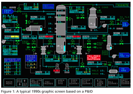
Common problems can include improper use of color, numbers sprinkled on a screen, poor graphics, lack of trends and conditions, and an inability to see irregularities quickly. Some operator interface screens have attempted to mimic P&ID drawings of the entire plant. This is not a good idea because it is confusing and does not allow operators to react quickly. A well-designed operator interface screen can allow for retention of important plant knowledge, enable change and condition monitoring, detecting problems (in some cases before they really become a problem), provide disaster recovery, and ensure accurate documentation. Concepts of what those qualities look like in practice vary a great deal based on what guidelines are being implemented. Paramount among these things: color needs to be used effectively.
A good operator interface screen should generally be devoid of color or have muted colors during normal operating conditions. The design should use bright colors and shapes to designate alarm and abnormal conditions. The screens also need to be cleanly organized. Similar types of visual elements should be grouped, and things should be labeled to be easily discerned.
Increasing Situational Awareness
Time needed to process the huge information flow on busy HMI screens can lead to an unsafe environment. Operators can miss alarms, leading to longer response times and a higher probability of operator error. An unsafe environment happens when the demand on an operator’s cognitive system is excessive. If an operator is faced with extremely busy HMI screens, and hundreds of alarms, situational awareness is decreased.
Maintaining situational awareness requires having the most effective HMI possible and presenting data in a way that supports operator management of the system. Operators need to be able to react quickly to process abnormalities with a minimal amount of thought. Focus and reference become the standard for operations rather than puzzling through a maze of data. If operators must scan through multiple graphics to check the state of the process, they are wasting valuable minutes that could be spent resolving issues.
Having a main screen that only adds significant color during abnormal operating conditions, the operator can respond to the specific problem. The operator identifies the malfunction immediately and responds appropriately for the situation. Information is cognitively and physically useable for the operator, allowing less mental stress in decision making and responding.
Keeping Enough Information
Screens are organized by levels and a level 1 screen, while not looking like your plant, will display the most important measurements the operators are responsible for. Levels 2 and 3 are those the operator finds to diagnose the problem. On a level 1 screen the operator can see what is normal and what is in alarm. Level 1 screens allow for rapid response. Levels 2 and 3 are a deeper dive into the data, and operators can drill down to access a more complete picture of what is happening during an alarm situation.
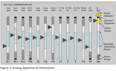
There are many kinds of elements level 1 screens can use including trending, symbols, alarm colors, and graphic indicators.
Trending is an important part of these graphic screens. It’s a good thing to put a visual trend on a screen and it be able to be seen from a long way away, and you don’t have to necessarily be able to discern a value from the trend, but abnormal changes need to be recognized. Changes in trends deviating from normal, identified quickly, are more quickly addressed. Usually, a trend will include a low or high alarm, complete with a change in color. A graph can also be used for trending. In any case the trending must be simple and easy to see.
When choosing to incorporate high-performance graphics, the operators may be a little surprised by the lack of color and animation, and managers might be worried that not enough information is being relayed. The opposite is actually true. Training time to use the operator interface is usually shorter than learning to use busy, over-loaded screens. More detail data is displayed on screens on a lower level. No information is lost.
A better designed operator interface results in a more efficient, safer plant. With increased situational awareness, less fatigue resulting in fewer mistakes, and faster response times, operators become more productive and effective. This makes simplification of the operator interface screen through high performance graphics or elements of high-performance graphics a reasonable choice for management.